
Design Systems for Software Engineers
A comprehensive guide to design system engineering (DSE): when it’s relevant, how AI changes things, and pointers for getting started. From Michael Abernethy, Principal Frontend Engineer at Rubrik


At some point in the lifespan of a successful product, a member of the team decides it has become too messy, and that what it needs is some kind of system/UX library/UI organization, since what used to be creative, clever UI approaches have become chaotic. At this point, the idea of a reusable components library often starts being seen as a solution.
This usually happens long after the product has found its product-market-fit and while it’s growing in usage, with 10+ designers and frontend engineers working on it. I’ve seen this scenario play out several times: at Skype, Skyscanner, and at Uber, where the outcome was the Base Design System, which was shared externally.
But how is a design system like this created, and what are practical tips for doing so? To find out, I turned to an expert on the topic, Michael Abernethy, who’s principal frontend engineer at the data security company, Rubrik. He’s worked on user interfaces and design systems for 25+ years, and has led Rubrik’s design system engineering team for the past four.
Today, we cover:
Wake-up call. Feedback from the CTO kicked off efforts to make the UI look more professional at Rubrik.
What’s a design system? More than a style guide, it includes standardized building blocks, and becomes a unified source of truth for the design and engineering team.
Building a design system. UX researchers, designers, and design system engineers collaborate. A step-by-step guide on how the team at Rubrik did so.
Design system libraries in the AI era. The new technology can be helpful for many tasks, but generating a consistent design system isn’t one of them. A look into areas where AI has helped Rubrik’s design system, plus emerging use cases like using Figma’s MCP, or running design system subagents.
When not to build a design system library. For startups and smaller teams, using a pre-built design system library like Material UI, Chakra UI, or Base UI can be a great alternative.
Investing in a custom design system library. Advice about good engineering skills and traits for when building a design system, the timelines – and Big Tech’s different approach.
Getting started and inspiration. A five-step, practical approach for building your own design system.
At growing tech companies, a design system is almost always put in place, eventually. I hope this is a useful guide about how to contribute to it – or take the lead – as an engineer.
With that, it’s over to Michael:
1. Wake-up call
At Rubrik, our “design wake-up call” is still talked about. It was six years ago, when the CTO, Arvind Nithrakashyap, casually remarked during a team meeting that the product looked “like a college project”.
The UI he was talking about was this early version:
His observation hit home because it was right! The product’s user interface did indeed look like it had been thrown together by engineers trying to build features as fast as possible – because that’s exactly what happened. This feedback was enough to prompt a UI overhaul that would see us revamp the whole product’s UI/UX for the better.
Most engineers will understand the urge to build quickly and ship lots of features in order to hit seemingly-impossible deadlines. Questions about how a product looks often take a back seat behind getting people to use the product. And let’s be honest, few of us engineers are famous for our artistic sensibilities, so a user interface we deem “good enough” during the early MVP stage may not cut it when pitching to potential enterprise customers.
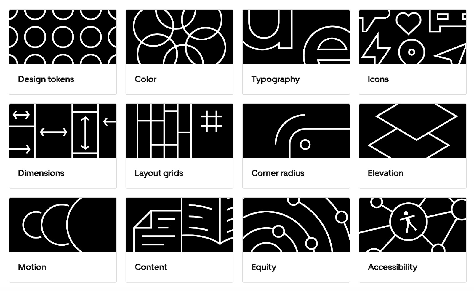
When we eventually completed this project at Rubrik, we were able to put a “Version 1.0” stamp on what we called the “Aura Design System Library”. It consists of 90+ React-based components, ranging from simple components (buttons, checkboxes, tabs) to complex components (page layouts or tables connected to GraphQL endpoints). Our work visibly improved the product, which went on to win awards and achieve industry-wide recognition.
2. What’s a design system?
The best, easiest way to think of a design system is as a brand for your software. It’s the unifying source of truth for a company’s or product’s entire identity across the suite of digital assets. But it’s also much more than just a logo. It includes:
Rules and guidelines
Patterns and visual language
Colors, fonts, spacing, and image styles
Reusable code components
Style guides and documentation that define the design system’s rules
Basically, it’s all the small things that go into making a website unique, so that customers instantly recognize the software. Like any strong brand image, a great design system is an incredible asset for a business because it creates an identity for software that’s as distinctive as Nike’s swoosh, or an apple with a bite taken out. Take a look at these two screenshots from popular websites:
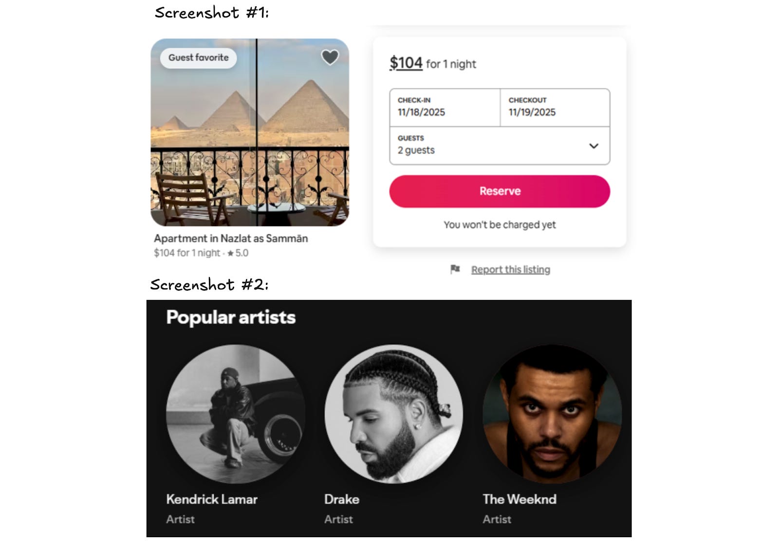
Without my help, you can probably identify the products in the screenshots above as Airbnb and Spotify. Chances are, you also have opinions about companies when you see their websites. That’s the power of branding – and of a great design system.
A design system is important for users, too. If they become accustomed to what a button or menu looks like in one part of the software, they know what a button or menu looks like in the rest of the application. A UX researcher might say this reduces the cognitive load of using the software.
Design system engineering
A design system engineering (DSE) team takes the concept of a design system, the branding, and the user benefits, and converts all this into code by building a design system library of reusable components that adhere to the strict standards of the design system. At Rubrik and at most Big Tech companies it works like this:
The design team creates the look and feel of the software in Figma.
The DSE team converts that into working React code (or Angular, or iOS, or Android, or the framework they use).
The design system library is the suite of reusable Frontend components that the DSE team creates. These are then bundled up into a stand-alone, JS/iOS/Android library and used across the entire product line. Using the library ensures a visually cohesive brand identity.
Smallest design system: a button
Imagine you’re a member of a Series B startup that’s just raised $20M in funding, and has found a product-market fit. Business is growing fast, but your UI is inconsistent, so you decide to standardize the design with a library and to improve the UI and UX.
Soon, you’re in the kickoff meeting of this effort with a few designers and design system engineers (with their DSE hats on) who are ready to crank out the new components. You start with the most common component of any design system library: the button. Below are some decisions to be made about this seemingly simple component:
Color. Which shade of teal is best for users, balancing readability with other colors on the page, and considering every possible background color on which the button could appear?

Text color. Which text color makes the button most readable to users on all devices, keeping in mind that not every user visits your software on a $6,000, 6k Pro Display XDR Monitor.

Height. How many pixels tall should the buttons be in order to draw attention without wasting vertical space and messing with page layout?

Border radius. What kind of curves fit best with the design aesthetic of the application?

Shadows. Do you want the design to be flat, or for the buttons to appear to rise off the page to grab attention, implying they can be pressed?

Font. Which font gives the button a modern, readable look? Should it match the rest of the site, or be slightly different to draw attention?

Answering just these six questions can take considerable time, including multiple back-and-forth discussions. The meeting may typically take an hour, and the bad news is that it will barely scratch the surface of everything that must be agreed. A proper discussion about a button will also include:
Color: Should there be extra background color options for less important actions?
Border: Should there be a color border, and if so, how thick?
Icon: Should icons in the button be allowed? If so, should they go before or after the text? What spacing should be used between icon and button?
Events: What should the button look like when the keyboard navigates to it? What about when hovering and clicking?
Animation: Should there be an animation when the button’s hovered over, should there be one when it’s clicked, and what about when something is loading?
States: What should the button look like when disabled? What about the cursor in the disabled state?
Mobile: Do you need to adjust any design decisions for iOS, Android, or both?
Accessibility: Do you need to adjust any decisions for color blind users?
Localization: Do you need to rethink decisions for different languages, or right-to-left writing systems?
All of these calls need to be made about a button – which is just one component! A simple design system usually has 15-20 components, and a complex one can have 50-100. Designing a full-fledged design system involves a lot more time and effort than many people realize because all these details add up.
Benefits of a design system
As mentioned, it’s a lot of effort to create a design system – but it brings several wins when complete. From the engineering viewpoint, common benefits are:
Faster delivery times. By creating an entire suite of reusable components, engineers eliminate the time and burden of creating the same component over and over on their own. Having a library also removes the need to “reinvent the wheel” by recreating new components. With a mature design system library, creating a page in the UI is almost as easy as dragging and dropping components onto the screen and wiring them up.
Higher quality. By utilizing skilled frontend/UI engineers to create the design system library, the quality of the entire product suite can be instantly visually upgraded. The UI’s quality can go from amateur to professional with the work of a few engineers.
More devs can contribute to the frontend. In my observation, most full-stack engineers lack expert-level skills in CSS and React. However, a well-written design system library encapsulates the difficult React/CSS/HTML code within the library, and allows full-stack engineers to contribute across the frontend without needing expertise in more niche areas like CSS.
“Premium feel” software. I have a saying that if you want to charge enterprise prices, your software needs to look like an enterprise product.
I feel many engineers don’t internalize the significance of premium interfaces. If your product charges a high price, customers expect a superior UI that goes beyond a simple and basic style. For example, it would be hard to entice an enterprise to pay $1M/year for software that looks like the image below. This site uses a standard, free, off-the-shelf Bootstrap theme with default colors and a font that doesn’t look good on the page. It looks the same as thousands of other free websites out there, making it hard for your customers to think “premium” when they see it.
Better collaboration across teams. With a shared library and design, engineering and product management can “speak the same language”, so that when a designer references a component called a “StatBox,” everyone understands what it means, for example. Even better, a tool like Figma allows design and engineering to virtually share code between teams.
Cost savings. Time is money, and a system like this makes engineers more productive because they deliver features faster, and the company can increase revenue quicker. That’s the theory, at least!
3. Building a design system
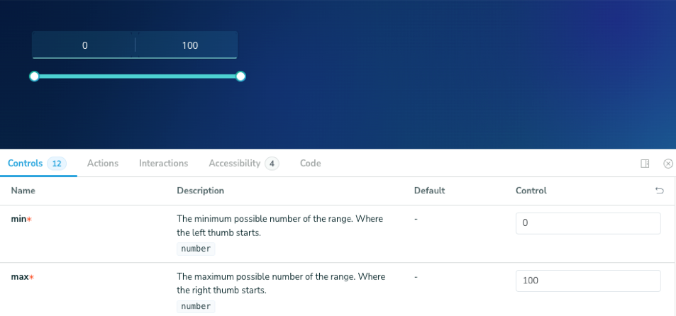
We’ll use an actual component to go through the steps of building a design system: the Range Bar component in Rubrik.
UX research
User experience (UX) folks are usually members of the design team who meet customers and talk through problems in simple terms, seeking feedback about usability, ease-of-use, and desired functionality.
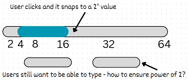
During this research, one theme might be that users dislike having to type numbers to specify a minimum and maximum storage capacity. They’d prefer an easier way to use the component in the UI.
The UX team gathers this feedback and puts together the component requirements:
A visual way to see min/max without typing
A way to remove the burden of calculating standard storage sizes (i.e: powers of 2)
A simple way to navigate with a few clicks.
Here’s a rough sketch of the component they create:
The designer
The design system team takes it from here. They receive the written details and rough sketch from UX and then create a visual guide for how it should look and behave across the application.
Figma is the tool of choice for almost every design team, and it’s the same at Rubrik. A designer creates the component, and realizes the best solution would be to expand the functionality of the existing Slider component by adding a “start” and “stop” thumb to the component, and automatically snapping it to a power of 2:
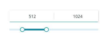
The designer also decides to include the ability to type in the minimum and maximum numbers, and to round up the numbers when the field is blurred. When the Figma design is complete, they pass it to the DSE team to turn into code.
Design system engineer
The design system engineer receives the Figma file and examines it from an engineering perspective, asking questions like:
Implementation constraints. Has the designer used designs that are impossible to implement in CSS, such as alpha-blended non-rectangular shapes, or gradients in places that aren’t supported?
Scalability. Has the designer used interactions that don’t scale well, like interactions or animations that trigger too many re-renders?
Performance. Has the designer created the potential for performance degradation; e.g., dozens of shadows in a moving element?
Edge cases. Has the designer considered edge cases like whether the user can set the min and max to be the same value, and considered error states such as how an invalid input should be displayed to users? Have they considered responsiveness (i.e: does it look good on both small and ultra-wide screens)?
Accessibility. How does it display keyboard focus, and how does a customer use the component without a mouse?
Localization. Does the design work in languages with many long words, and what about right-to-left writing systems?
Design system engineers and designers work closely to iron out these details, and once they’re sorted, the engineer starts coding.
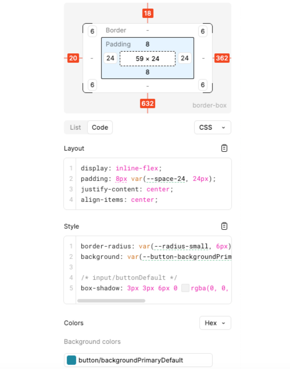
Coding typically starts in Figma’s Dev Mode. This is a simplified view tailored for cases where engineers want to implement Figma designs. They can see key information about the design in one place, like the sizing of the component, spacing, etc. There’s even the option to copy/paste the CSS from Figma and insert it directly into the code.
Coding
Below are key things to consider when beginning to put together the code of the component:
Naming. A good name is one that’s agreed by design and engineering, so that both use the same terms. Good naming also helps the Figma MCP (Model Context Protocol) work better. For example, for this component, “RangeSlider” feels more suitable than MinMaxStorageSlider. It’s more expressive and doesn’t expose implementation details that might change later.
API. For React components, the API means setting the prop names to be descriptive and consistent with prop names in the rest of the design system library.
Future usage. The engineer should think about how this component will be used in the future, and support likely use cases. For example, should the RangeSlider allow the option to make the min or max ranges unchangeable? That decision could change how the component is coded in React.
Coding a high-quality component comes with plenty of nuance, which is why it helps to have experienced engineers build them. Below are some small details that are important to get right:
Performance: Will the component stay performant if the user slides the RangeSlider’s thumb up and down quickly? Do the events need to be debounced?
Theming: How will the component look in a different theme? Rubrik has three themes for its product, and components need to look good in them all.
Accessibility: For example, how is the component used without a mouse? For a component like a RangeSlider, accessibility can be quite complex. In Rubrik’s case, we decided to add support to control the component with the four arrow keys (left/right control the minimum, up/down control the maximum).
There are three less-discussed areas which become increasingly important to a well-built modern design system library.
Analytics: Often an afterthought, but perhaps shouldn’t be! At Rubrik, we recently faced a dilemma where we wanted to massively increase our analytics usage, and started to log pretty much everything. The challenge was that there were already 1,200 different pages in the application! Adding analytics to each didn’t make sense.
Instead, we added analytic tracking code into our design system library’s components. For example, when a button is pressed, it (abstractly) sends a tracking event to our analytics platform. As design system engineers, we went through each component and added analytics depending on how users could interact with it.
With this approach, we started to log around X4 more events, which were all relevant for analyzing our application’s usage. The best part was that devs didn’t need to add a single line of code to get more granular analytics – they just needed to use components from our design system library!
Async awareness: React’s v18 and v19 have introduced and expanded the notion of “async React,” which aims to improve user experience and the code’s performance by processing less important rendering in the background, and prioritizing certain renders. For example, an input box that’s being typed in should prioritize displaying the key typed, but can defer the display of an error state if a key press triggers a validation error.
At Rubrik, we’ve started re-coding our interactive components to use the Async React approach. These kinds of optimizations in the design system library can make an application feel snappier and quicker and also reduce the chance of another engineer introducing lag into the UI.
Loading states: Modern UI like React Server Components rely on loading data in the background as the page renders. As a result, displaying loading states becomes more critical, as a component may be rendered immediately even if the data it displays isn’t available yet.
At Rubrik, we’ve re-coded our components that display information to handle loading states. This allows devs using each component to pass in a “loading” property and ensure the application keeps a consistent look, even when data isn’t present.

Testing
As with any quality software, we want to be thorough with testing. At Rubrik, we use several layers of testing to ensure the design system library minimizes regressions:
Unit tests (including writing lots of them with AI). We use unit tests extensively, which is a common approach for any standard React component.
Over the past year, we’ve come to rely heavily on AI to write unit tests, and have found that it not only creates time savings, but also hits more edge cases. With AI, we can generate tests with extremely high code coverage from surprisingly short prompts.
Storybook. This is an open-source tool for publicly displaying and documenting UI components outside of the main application. It allows engineers to create “stories”, which are examples of components in different states and configurations. Stories allow Frontend engineers outside of the DSE team to visualize the components without the complexity of a full application.
Storybook also allows other engineers to toggle and adjust the props into the components and copy/paste the resulting code. Engineers will then have the ability to visually customize the code to their exact needs.
At Rubrik, we use Storybook extensively and utilize it as a showcase of all available React components within our application. Nearly every Frontend Engineer visits our internal Storybook site on a weekly basis.
Chromatic: This is a visual regression testing tool. When making a change to a single component, an engineer needs to check that it works correctly across all four major browsers and supported themes. Plus, they need to check that any component dependent on the updated component works correctly.
Chromatic ties into Storybook and takes a visual snapshot of every component, comparing it to the previous snapshot to check for pixels that have changed, which it flags up. Devs can then examine how a change affects the rest of the library. It’s a great way to test regressions at scale.
At Rubrik, Chromatic runs on every pull request that touches any file within our design system library. We do this by adding Chromatic as a blocking reviewer in GitHub for all these files. For us, Chromatic takes about 15 minutes to run against the design system library suite. If it finds no regressions, the bot removes Chromatic from the blocking reviewers list. If something has regressed, the blocking reviewer stays and the engineer who submitted the PR resolves the issue.
Thanks to running on every pull request, Chromatic has prevented 100+ bugs from shipping to production at Rubrik. Without it, I suspect most of those changes would’ve slipped through and have only been discovered later.
4. Design system libraries in the AI era
Can a team use AI to create a complete, well-designed, complex design system library from a single prompt? Today, that would be asking too much of AI, but maybe one day soon it will be possible. At Rubrik and in my own experiments with AI and design system libraries, I’ve found several cases where AI is extremely helpful, and also times when it’s not. In some situations, it even damages the work.
 | A guest post by
|